You must have noticed it… cafes are looking more and more like your lounge room, office spaces more like your home. There’s no denying it, the lines between commercial and domestic designs are getting harder and harder to define.
The world of interiors is out of focus, the difference between commercial and domestic spaces harder to define. In some homes, this can be as fundamental as the use of an industrial palette of concrete, metal and pre-fabricated surfaces. In others, homeowners are requesting everything from restaurant-style kitchens and home offices that give off a corporate vibe, to hotel-inspired bedrooms and bathrooms that rival luxury spas.
But something more interesting still is afoot – a reversal, with Perth hospitality spaces aspiring to a residential aesthetic that offers customers a comfort and familiarity akin to their own homes.
"I would agree that aspects of hospitality design can influence the home, but I would also debate that the residential design market likely influences commercial design," says Nadia Paulse, director at ID by MONO, and the name behind eye-catching fitouts such as Perth's Lalla Rookh and the Mangrove Hotel in Broome.
"There is refinement in residential design, and a softening, which sometimes commercial design cancels out because of its high occupancy, however there are now far more textural and warmth undertones present in commercial designs." And when people experience good commercial fitouts, Nadia says, "they draw confidence on how materiality works in subtle or bold ways for use in the home."
Architect Dimmity Walker from Space Agency says people wish to recreate their experience of being in commercial spaces. "There's an enormous amount of 'lifestyle' images available to people from so many diverse sources – magazines, internet sites, television shows – but when people go out to eat in restaurants and stay in hotels, they get something beyond the image," she says. "They get an experience."
She says it is no surprise, therefore, that people should be informed by these experiences in the design of their own living spaces. "They may be inspired by interesting lighting or colour schemes, material combinations or spatial qualities," she says. "Sometimes commercial design can be more like a veneer or a stage set – in the spaces we design it is important to us to express something authentic about the space, the brief and materials we are working with."
Space Agency is responsible for some of Perth's most groundbreaking hospitality designs of late, including restaurant Bread in Common (which was the recipient of five Australian Institute of Architects Awards), and The Alex Hotel in Northbridge, for which it collaborated with nationally renowned interior design firm Arent & Pyke.
Sarah-Jane Pyke, principal at Arent & Pyke, says the idea of 'hotel as home' was
a key concept for the hotel interiors. "All of the furnishing elements were selected to reflect a residential aesthetic," she says. "We wanted to instil the spaces with a sense of warmth and comfort that would make guests feel at home, secure and private, even within the public areas of the hotel."
To do this, the designers employed colour, a variety of textures (especially vintage and handmade pieces), and a collection of objects that reflect the personality of the hotel.
Dimmity says the design of the 74-room hotel encourages people to inhabit the communal areas, rather than hide away in their rooms. "It was very important that the design of these spaces – the lobby, mezzanine and terraces – convey a welcoming and comfortable environment," she says. "We looked at removing some of the traditional barriers between the staff and the guests, so that they are on the same side of the counter when checking in, or standing next to the person making the coffee in the lobby cafe, or using the communal kitchen to make
a cup of tea on the mezzanine.
"Internally, the finishes are deliberately kept as raw as possible – with exposed pipework and concrete soffits – and in contrast, the styling and furniture by Arent & Pyke is eclectic, fun and quirky, and provides many options for inhabiting the hotel living rooms."
Certainly in regards to hospitality, today's work/live/play ideology and mobile, multitasking lifestyles are driving this change, with coffee shops and casual dining establishments, for instance, doubling as offices for customers. The spaces we inhabit are merging to cater to our working, social, and private selves.
This was the case when husband-and-wife team Mark and Stephanie Sayers embarked on their business ventures, which reflect the aesthetic of their own home. Owning and running the highly successful Sayers Cafe in Leederville,
they then opened Sayers Sister in Northbridge, a character-filled and eclectic mix of chandeliers, exposed brick, spice jars, oversized antique sugar bowls, plush armchairs, gilt mirrors and fresh flowers in vases.
"We wanted people to feel like they were in our home, sitting in our family room on cosy chairs or around our dining table," Stephanie says. "The large central concrete table was so that people could enjoy the company of others and the staff while sitting at the counter, and the open kitchen was so that customers can pop past and chat to the chefs and see what goes on."
The red brickwork and low-hanging light fitting at the concrete counter are very similar to Mark and Stephanie's own kitchen, the exposed recycled bricks a nod to their living room.
"Antique items we have collected are scattered around the cafe with the
cosy wing-back chairs," Stephanie says. "Brown leather and photo walls, large mirrors and wrought iron lighting, and a bookshelf-style wine area make it very much like home."
Designers are focused on adding more natural light, using warmer and more appealing colours, brighter fabrics, wooden floors, live plants, and beverage stations to create more welcoming and familiar surroundings. Even hospitality-specific furnishings are now being created for a more homely look and feel, oriented in the style of sitting or living areas. Some local examples are May Street Larder, Bistro Guillaume in Crown Perth, and The Flour Factory in the CBD.
East Fremantle's culinary new kid, May Street Larder, features quirky and homely interiors that were the brainchild of stylist Clare Ryan and owner Eamon Sullivan.
"It's welcoming because it's light, bright, interactive and not perfect," she says. "It's stimulating, with a bright colour palette, indoor plants, soft furnishings, quirky prints, and featured tea towels and lighting."
A number of the design elements would be easily translatable into a home, Clare says, such as the pendant lighting, the couch area, floor rugs, wallpaper, and
the dining chairs and tables.
"I think the use of mixed materials and furniture is relatable," she says. "We had to look at how to work with concrete and yet still create a warm and inviting space, which would be common for someone designing their home."
It was all about zoning and functionality, she says, with an intimate and colourful lounge area making the most of dead space at the back of the restaurant. "By adding some soft furnishings, comfortable sitting chairs, a colourful rug and coffee table, this little corner is a mini loungeroom – and the colours really lift the area."
Lighting has also been zoned, with Clare creating feature lighting plans for each different segment. "The heavy, industrial-inspired lighting at the front of the restaurant is perfect for an intimate dining space; same with the pendants around the counter," she says. "They aren't oversized and overwhelming, even though there are nine of them, and the detailing inside each light is just divine, and adds to the 'antique' larder style."
Andy Freeman, owner of The Flour Factory, says that, for his inner-city public house, he favoured a lot of timber, specifically jarrah slab from Narrogin.
The venue sprawls across three floors of an historic 100-year-old flour mill,
and resonates with a meticulously curated blend of New York deli-meets-Spanish Bodega cocktail bar.
"The use of jarrah slab and timber- stack bar detail adds a warm texture
to the potentially cavernous space," he says. "Most people comment on the
wood and the 10 one-metre gold leaf black dome lights in the main bar, which bring the ceiling down to a seemingly lower level and provide the sense of intimacy and warmth."
Additionally, the design draws on the golden hue of filament globes to add a warm ambience from day to night. "Lighting is a very important part of any design," Andy says. "Our handmade pendants offer an effective feature that adds warmth and detail to the bar area that can be applied to a kitchen or even alfresco area."
Andy says the furniture selection (leather booths and banquettes, jarrah slab, handmade tables and benchtops) is also a crowd-pleaser. "The tables could easily be used as a long dining table indoors or outdoors, and the timber-stack design is an affordable option that adds texture to a wall or panel within a home."
Andy's advice to Perth homeowners is that if they see something they like, they should feel free to quiz the venue for info.
"A lot of commercial fitouts use the talents of designers, which can be costly for homeowners," advises Andy. "The fittings, applications, and textures can be applied to homes in unique ways to give that designer feel without needing to engage someone to do that for you. Most venues are happy to share where they got elements from, so you can do it yourself."
THE COTT
Photography Ross Wallace.
East coast interior-design outfit Hecker Guthrie has introduced a playful sense
of nostalgia into the Cottesloe Beach Hotel. With a subtle play on the colour palette of local rival surf clubs Cottesloe and North Cottesloe, the space is layered with 50s-style furniture, lighting, and art works produced by American artist Drew Tyndell. The bars have a strong geometric presence, with graphic tiling and bold pendant lighting by HK Living.
THE ALEX HOTEL
Raw interior-material choices include exposed pipework and concrete soffits paired with Arent & Pyke's eclectic, fun, quirky styling and furniture selection, which welcomes guests to 'make themselves at home' during their stay. The 74-room hotel emphasises the communal areas, prompting guests to gather rather than hide away in their hotel room. Architects Space Agency removed some traditional barriers – such as check-in counters – in the cafe and the communal kitchen.
THE MANGROVE HOTEL
Photography Joel Barbitta.
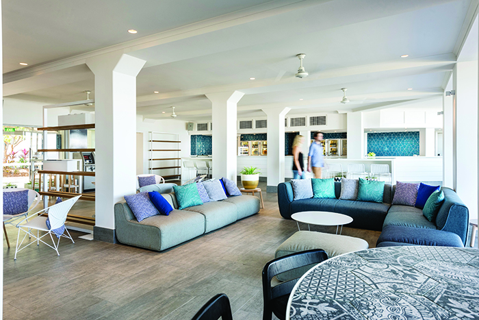
The spacious and airy Mangrove Hotel in Broome was completed by ID by MONO, the company briefed for a full refurbishment of the 10,000sqm hotel. It now offers various categories of guest rooms and private suites, a large outdoor entertainment zone, gymnasium, and four function rooms, plus numerous restaurants and bars.
SAYERS SISTER
Photography Ross Wallace.
Sayers Sister was specifically designed to feel like the home of owners Mark and Stephanie, resulting in a character-filled space with an eclectic mix of chandeliers, exposed brick, spice jars, oversized antique sugar bowls, plush armchairs, gilt mirrors and fresh flowers in vases.
MAY STREET LARDER
Photography Richard Jefferson.
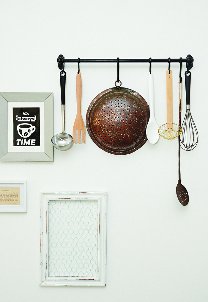
A mix of light and dark wood, and white walls and a white ceiling balance May Street Larder's heavy concrete flooring, concrete countertop, and concrete-looking pendant lighting. Mixed woods and wallpaper inspired by an old tin wall add a rustic edge, alongside light-wood furniture, dark-wood window ledges, and old wood pallets under the counter. Colours and patterns are deliberately mismatched for interest, with the vintage pieces quite heavy and dark against modern hues that are fresh and inviting in the form of the soft furnishings and accessories. A mix of kitchen utensils and items has been used to decorate the space, adding a domestic highlight.
BRIKA
Photography Ross Wallace.
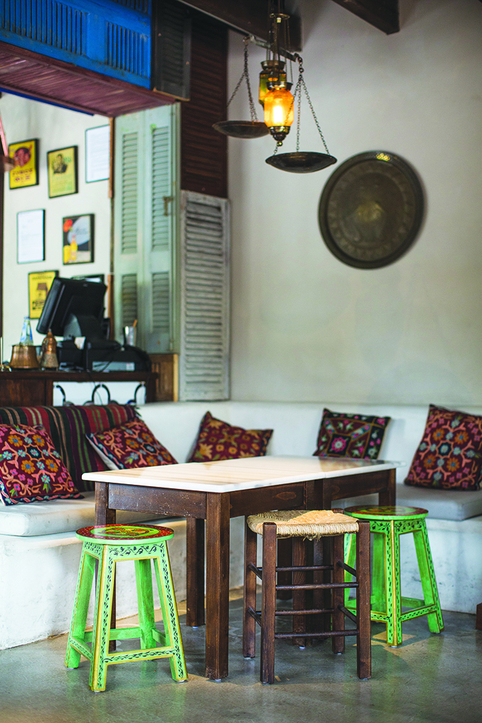
Greek tavern-inspired Brika features coloured wooden louvres, rustic lanterns, polished concrete floors, exposed rafters and whitewashed walls, with an adjoining shaded area for alfresco eating. A feature graffiti wall – 'Athenian street art' – comes courtesy of talented street artist Jerome Davenport.
BREAD IN COMMON
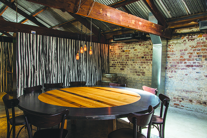
Photography Ross Wallace.
Space Agency designed the Bread in Common artisan bakery and restaurant within a 1900s pharmaceutical warehouse. It features timber trussing and exposed brick walls, a bar, and wine shelves, while the front maintains the original ceiling, door and window openings to the street. The robust material palette is softened by bespoke timber tables designed in collaboration with
furniture designer Paul Morris of Join, and a series of 'carpets' that are silk-screened directly onto the concrete floor by artist Angela Ferolla.
THE FLOUR FACTORY
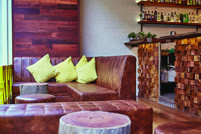
Photography Cheyne Tillier-Daly.
Historic 100-year-old flour mill The Flour Factory features jarrah from Narrogin across its three floors. The interiors were an inspired blend of New York deli meets a Spanish Bodega cocktail bar. Stacked-timber bar detailing provides texture, and 10 one-metre gold-leaf black dome lights in the main bar create ambience. Leather booths and banquettes, and jarrah slab handmade tables and benchtops make it a home away from home.